Atomic Design & Design Tokens for consistent design systems
A modular structure of UI building blocks based on the atomic design principle creates a common language between design and code. In this article, we show you how to use design tokens to create consistent interfaces and efficient development processes – including practical examples.
When design and code are not clearly aligned, inconsistencies arise, resulting in additional work. Design systems provide the necessary structure for this – and atomic design forms the methodological foundation on which many of these systems are built.
What is Atomic Design?
Atomic Design is a conceptual model for building design systems that was introduced by Brad Frost in 2013. The basic idea is that instead of designing entire pages or large components directly, you start with the smallest, reusable building blocks – the so-called "atoms." Step by step, these are combined to form a stable and flexible system.
The five levels at a glance:- Atoms: Simple elements such as buttons, colors, fonts, or input fields.
- Molecules: Combinations of atoms, for example, a label with an input field.
- Organisms: Larger UI areas such as a complete header navigation.
- Templates: Layouts that define how content is structured.
- Pages: Specific pages with real content – what users ultimately see.
This modular structure makes the design easy to understand, easy to maintain, and consistent across many pages or applications.
The role of design tokens in Atomic Design
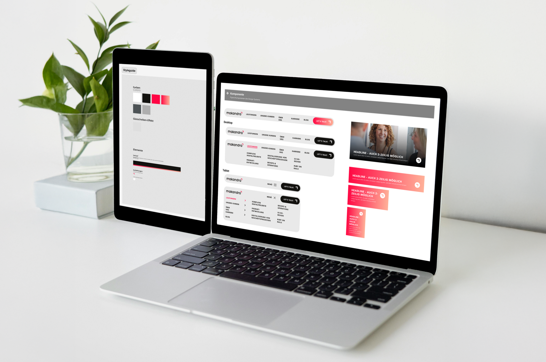
Design tokens abstract design decisions such as colors, spacing, typography, or shadows into central variables. This creates consistency and enables seamless synchronization between design tools (e.g., Figma) and codebases (e.g., SCSS, Tailwind, or design system components in React).
Let's take our makandra colors as an example:
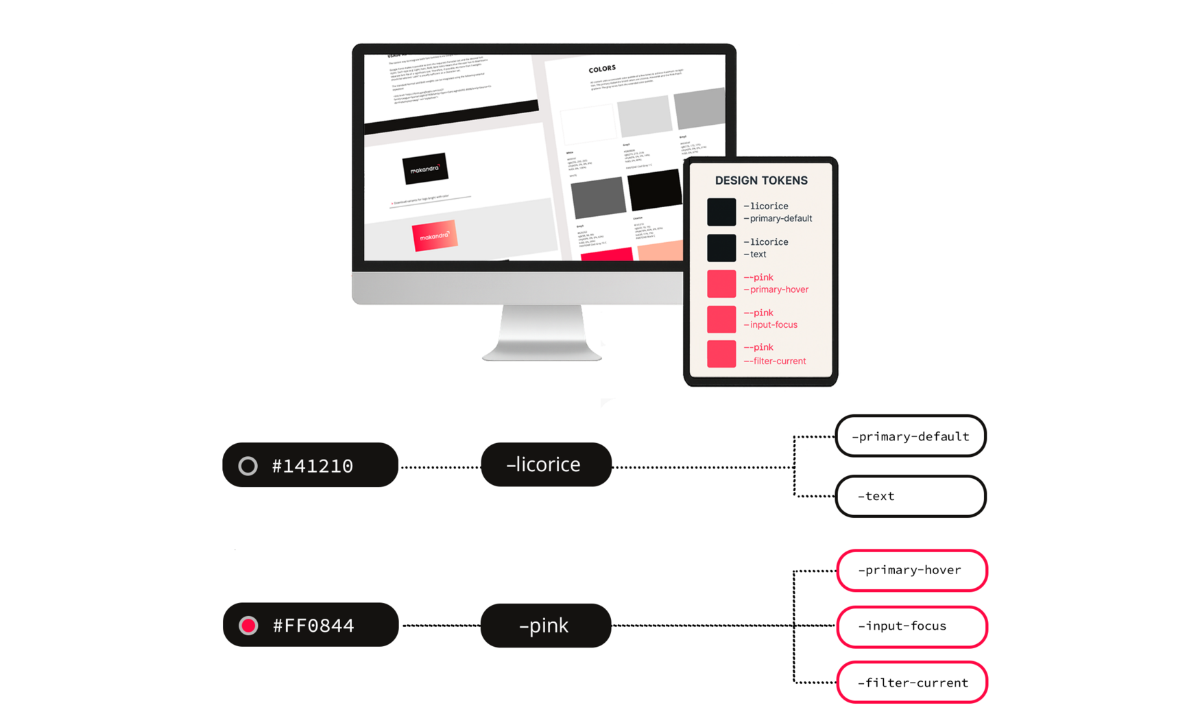
Our deep black-brown
#141210 > --licorice
- primary-default (default color for buttons, but also for links, for example)
- text (default color for text)
A vibrant shade of pink
#FF0844 > --pink
- primary-hover (hover color of buttons or links)
- input-focus (line color for text input)
- filter-current (selected filter/category for blog posts)
These tokens are integrated into both Figma and the code. This allows us to change the entire color scheme – for example, for a dark theme or a brand overhaul – without having to touch each component individually.
Why missing design tokens lead to inconsistencies
Without design tokens, inconsistencies can easily arise – for example, in spacing or font sizes.
- Example:
In a project, spacing values of 22px and 24px were accidentally mixed, even though the design system actually specifies a fixed spacing increment of 8px (e.g., 16px, 24px, 32px). The values were transferred manually without reference to central definitions.
With tokens, it would have been clear which spacing token (e.g., spacing-md) had to be used. This keeps the layout consistent, regardless of the specific pixel value, and avoids implementation errors.
Best practices for implementation
An effective design system is based on clear principles and proven methods. The following best practices help ensure consistency and scalability right from the start:
- Build a structured component library: Ideally in tools such as Figma, coupled with a component base in the code (e.g., in React or Vue).
- Naming conventions and documentation: Consistent naming and clean documentation are essential for keeping the system understandable.
- Keep design and code in sync: Tools such as Style Dictionary, Token Studio, or Storybook help manage design tokens and components in sync.
- Grow iteratively: A design system does not have to be complete right away – atomic design is excellent for supporting incremental development.
Advantages of design tokens
A well-structured design system with tokens reduces maintenance effort, avoids inconsistencies, and improves workflow. Figma now directly addresses this principle with features such as variables and flexible token groups.
Here is an overview of the most important advantages:
- Central management
All visual design values are defined in one place and can be easily updated. - Consistency across all platforms
Whether web, mobile, or print, tokens ensure a consistent look and feel. - Automated changes
Adjustments to tokens affect all connected components directly. - More efficient collaboration
Design and code work together – misunderstandings and duplicate work are avoided. - Scalability
Ideal for complex systems with many components, brands, or themes. - Themes and variants
Dark mode, different brands, or responsive design can be easily implemented. - Tool support
Modern design tools such as Figma integrate tokens natively, making them even more accessible.
Conclusion
Atomic Design offers a well-thought-out methodology for managing the complexity of modern interfaces. Combined with design tokens and a clean component model, it creates a powerful design system that enables consistency, scalability, and better collaboration between UI/UX and development.
For us at makandra, Atomic Design is an indispensable tool on the path to high-quality digital products – structured, maintainable, and user-centered.
